Customization
SDK predefined Theme for UI elements and allows customization of them to match your design manual. Customization will be possible at the start of the application, with predefined protocol, similarly like DateioSdkApiConfiguration protocol.
You might change:
- texts,
- icons and images,
- fonts and text sizes,
- colors (both normal and dark theme),
- shadows,
- spacing,
- activity indicators,
- element radiuses,
- enable/disable specific features and UI elements.
Custom activity indicators
To change activity indicators you need to implement DateioSdkUIConfiguration protocol and pass it to the DateioSdkApp.shared.configure method.
To change offer list loading activity indicator you have to set offerListLoaderUIKit variable in the DateioSdkUIConfiguration protocol.
To change offer list next page loading activity indicator you have to set offerListNextPageLoaderUIKit variable in the DateioSdkUIConfiguration protocol.
To change activation button activity indicator you have to set activateButtonLoaderUIKit variable in the DateioSdkUIConfiguration protocol.
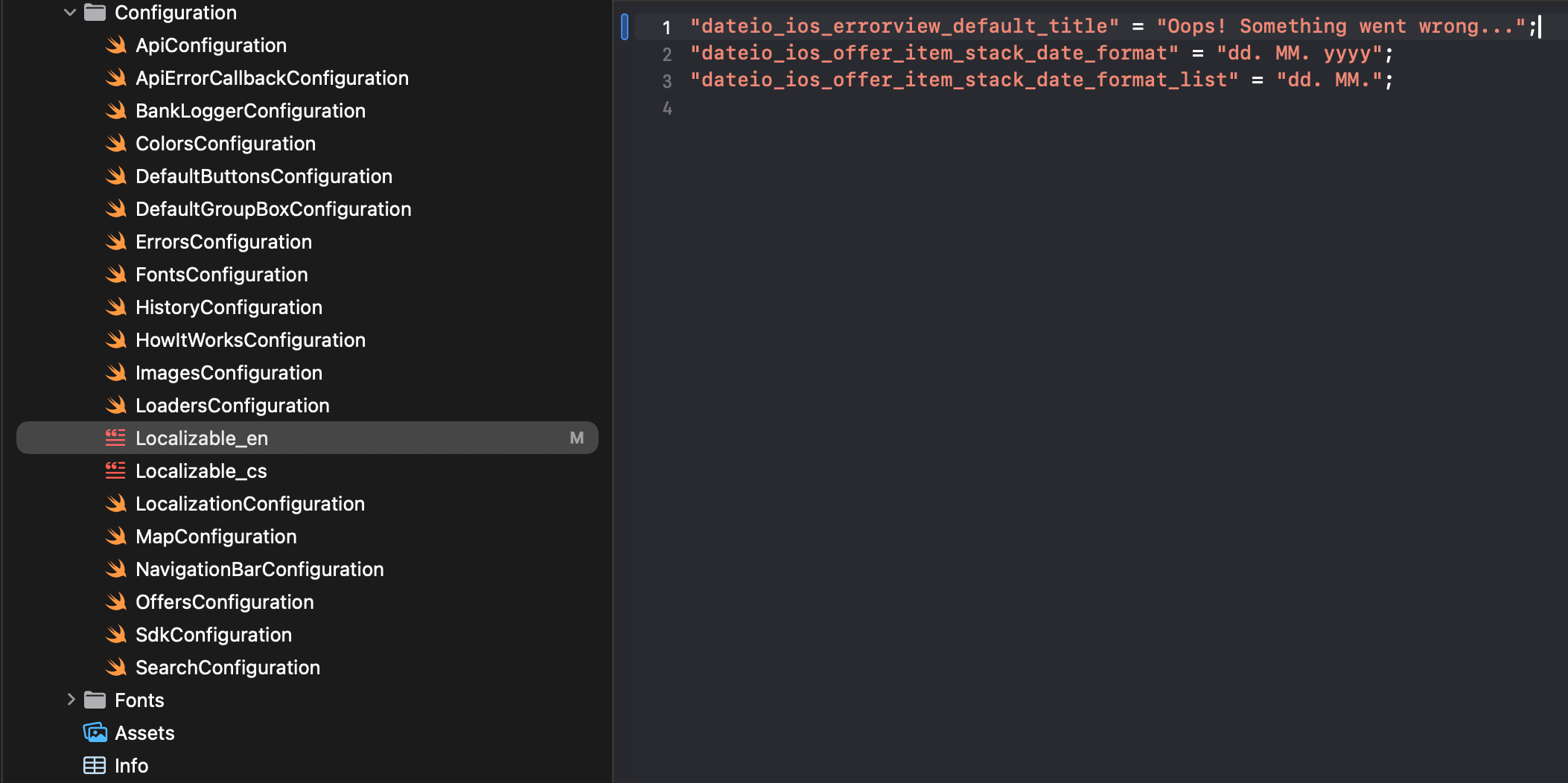
Text changes
You can change texts via *.strings files. Process is made through implementation of the protocol DateioSdkLocalizationConfiguration. And Default implementation is:
Variable languageCode overwrite language set by system. customLocalization is key value pair which contains overridden localization keys (after it is processed and initialized). defaultLanguageIdentifier is language identifier which is used for find localization as first.defaultLanguageCustoms is array of language identifiers for which is looks for *.strings files with overridden localization keys.
func readCustomLocalazation() is helper for read custom localization keys in *.strings files.
Example of texts change (you have to create Localizable_language_code.strings file in your Xcode project and insert key with translation):
Icons and images
In list below you can find all available icons and images:
dateio_ic_activate24.px x 24.px – Shown when offer is activated. Both in offers list and detail.dateio_ic_badge_is_extended16.px x 16.px – Shown in badge when offer is extended.dateio_ic_badge_is_new16.px x 16.px – Shown in badge when offer is new.dateio_ic_badge_place16.px x 16.px – Shown in badge when we have user location.dateio_ic_cashback48.px x 48.px – Shown in history card, history and in CCB history. Indicating cashback.dateio_ic_chevron24.px x 24.px – Icon used to indicate navigation on shop item click.dateio_ic_close24.px x 24.px – Close button "X" for simple how it works and navigation.dateio_ic_close_circle30.px x 30.px – Close button (X) for popups and detailed how it works.dateio_ic_close_floating_error32.px x 32.px – Icon for close floating error. Shown only when dateio_errors_show_close_button = true.dateio_ic_coins24.px x 24.px – Shown in history. Indicating full paid amount.dateio_ic_copy24.px x 24.px – Icon used in voucher dialog to copy the voucher code.dateio_ic_date_card24.px x 24.px – Shown as badge on offer card.dateio_ic_date_detail24.px x 24.px – Shown as date badge or section in offer detail.dateio_ic_email24.px x 24.px – Icon for button "send link" in offer detail.dateio_ic_empty48.px x 48.px – Shown when offer list have no offers.dateio_ic_ending_soon24.px x 24.px – Shown as badge when offer is ending soon. Both in offers list and detail.dateio_ic_error48.px x 48.px – Full screen error. E.g. detail unable to load, offers cant be loaded and etc.dateio_ic_eshop24.px x 24.px – Icon for "affiliate" offers and button "go to e-shop" in detail.dateio_ic_header_saved48.px x 48.px – Icon for "totally saved" component on main screen. Might be disabled.dateio_ic_hourglass24.px x 24.px – Shown in history when transaction is waiting for verification.dateio_ic_info16.px x 16.px – Shown in history, for info when cashback will be paid.dateio_ic_location40.px x 40.px – Icon used in shop list screen next to shop distance.dateio_ic_map24.px x 24.px – Navigation icon providing navigation to offer map screen.dateio_ic_map_location24.px x 24.px – Icon used in offers map screen controls button to zoom to user location.dateio_ic_map_type24.px x 24.px – Icon used in offers map screen controls button to switch map visual type.dateio_ic_navigate32.px x 32.px – Icon used in offer detail to navigate to the offer location. Not activated offer version.dateio_ic_navigate_activated32.px x 32.px – Icon used in offer detail to navigate to the offer location. Activated offer version.dateio_ic_navigation_124.px x 24.px – Icon for first navigation action.dateio_ic_navigation_224.px x 24.px – Icon for second navigation action.dateio_ic_navigation_back24.px x 24.px – Icon for go back action in navigation.dateio_ic_question24.px x 24.px – Icon for help button in navigation.dateio_ic_offer_about24.px x 24.px – Shown in detail - about offer icon. Might be disabled.dateio_ic_offer_locations24.px x 24.px – Shown in detail - where offer might be redeemed icon. Might be disabled.dateio_ic_offer_terms24.px x 24.px – Shown in detail - offer terms icon. Might be disabled.dateio_ic_offer_transaction_history24.px x 24.px – Shown in detail - transactions history icon (only for CCB). Might be disabled.dateio_ic_offer_voucher_history24.px x 24.px – Shown in detail - voucher usage history icon. Might be disabled.dateio_ic_ok24.px x 24.px – Icon used in positive pop up dialogs.dateio_ic_online24.px x 24.px – Shown as badge for online offers. Both in offers list and detail.dateio_ic_percent28.px x 28.px – Show when dateio_percent_as_image = true. Discount with percentage will use this icon instead of text.dateio_ic_place24.px x 24.px – Shown as badge for brick store offers. Both in offers list and detail.dateio_ic_redemption24.px x 24.px – Shown in CCB detail, when user makes redemption.dateio_ic_returned_goods24.px x 24.px – Shown in CCB detail, when user returned goods.dateio_ic_search18.px x 18.px – Icon for search in main page and for leading icon in search input.dateio_ic_shop_brick24.px x 24.px – Icon for brick shops in offer detail.dateio_ic_shop_online24.px x 24.px – Icon for online shops in offer detaildateio_ic_tutorial_close18.px x 18.px – Close tutorials icon.dateio_ic_voucher24.px x 24.px – Icon for vouchers. Shown in detail and in voucher action on offers list.dateio_ic_warning24.px x 24.px – Shown in contextual warnings and errors. E.g. activation failed.dateio_img_category_placeholder490.px x 320.px – Placeholder for category.dateio_img_detail_logo_placeholder48.px x 48.px – Placeholder for logo in detail.dateio_img_detail_placeholder700.px x 280.px – Placeholder for main image in detail.dateio_img_detailed_bottom_sheet_step_1130.px x 100.px – Image for first step in detailed help popup.dateio_img_detailed_bottom_sheet_step_2130.px x 100.px – Image for second step in detailed help popup.dateio_img_detailed_bottom_sheet_step_3130.px x 100.px – Image for third step in detailed help popup.dateio_img_placeholder116.px x 116.px – Placeholder for main image in offers list.dateio_img_voucher_bg315.px x 160.px – Background for vouchers in image voucher dialog. Used for vouchers with regenerate option.dateio_img_voucher_error200.px x 200.px – Error image when there is an issue with the voucher.dateio_img_voucher_small_bg315.px x 114.px – Background for vouchers in image voucher dialog. Used for vouchers without regenerate option.dateio_img_welcome_banner96.px x 84.px – Image for welcome banner. Used only when TutorialType.HOW_IT_WORKS_WIDGET is set.
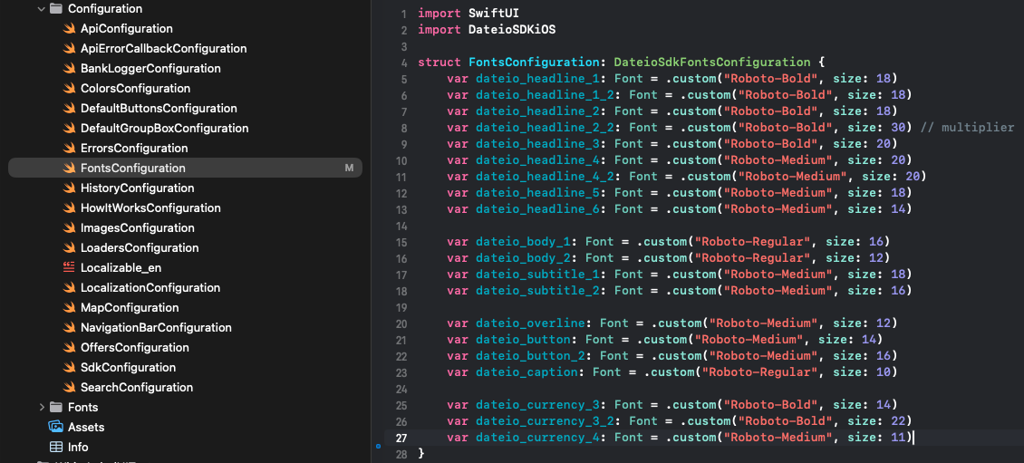
Fonts and text sizes
Fonts can be configured in the configuration file provided together with the SDK files, specifically in FontsConfiguration. Here, you can define either the system font or a custom font available in your Xcode project.
Example:
Colors
SDK use set of colors listed below.
Dark mode is supported in the SDK using adaptive color objects that you can define in your asset catalog and then map these objects to the SDK using the DateioSdkColorsConfiguration protocol implementation (shown in the demo project). More information about adaptive color objects here: Apple - supporting dark mode.
You can find preview and how we use these colors in our Figma.
Surfaces - backgrounds
dateioSurfaceBackground– For page background.dateioSurfacePrimary– For main elements e.g. offer cards, floating parts, popups.dateioSurfaceSecondary– For big parts that need more emphasis - e.g. main section of offer in detail.dateioSurfaceTertiary– For navigation background.dateioSurfaceQuaternary– For semi-highlighted parts e.g. card with user savings.dateioSurfaceQuinary– For tutorials background.dateioSurfaceBrand– For product background - usually main bank color.
Fill - buttons, icons and lines
dateioFillPrimary– For main buttons and icons e.g. activate offer, go to e-shop, search or other primary buttons.dateioFillSecondary– For accompanying icons - not used as we use icons overlaying.dateioFillTertiary– For new and extended badges.dateioFillQuaternary– For line dividers and linear progress background.dateioFillDisabled– For disabled background buttons or other disabled elements, used in conjunction with "dateioTextDisabled".
Text - font colors
dateioTextPrimary– For main and important elements e.g. headers, offer name, section name and etc.dateioTextSecondary– For supplementary text or long blocks of text.dateioTextTertiary– For additional neutral messages e.g. empty offers or low importance texts e.g. date of transactions, shop address and etc.dateioTextDisabled– For disabled text color or disabled buttons text. Use in conjunction with "dateioFillDisabled".dateioTextPlaceholder– For leading / trailing icons in input and placeholder.
State and StateWeak - colors according to meaning of the message
dateioStatePositive– For positive texts e.g. discount, client received cashback.dateioStateNegative– For negative values.dateioStateError– For error texts.dateioStateWarning– For alert texts and other warnings messages e.g. offer will be ending soon.dateioStateInfo– For important but non-interactive messages or texts e.g. offer activated button text.dateioStateDefault– For neutral messages or badges text e.g. offer ending date, online badge.dateioStateActive– For clickable texts, links or others elements, but not for buttons. For buttons "dateioFillX" is used.dateioStateWeakPositive– For background to "dateioStatePositive" - positive messages.dateioStateWeakNegative– For background to "dateioStateNegative" - negative values.dateioStateWeakError– For background to "dateioStateError" - errors messages.dateioStateWeakWarning– For background to "dateioStateWarning" - offers ending soon and other warning messages.dateioStateWeakInfo– For background to "dateioStateInfo" - offer activated button or text, other non-interactive backgrounds.dateioStateWeakDefault– For background to "dateioStateDefault" - neutral messages and badges.dateioStateWeakActive– For background to "dateioStateActive" - active accompanying color.
Monocolors - similar or same in normal and night theme
dateioMonoLight– For secondary buttons text e.g. go to history, for extended and new badges. Should be similar in light and dark theme.dateioMonoDark– For primary buttons text e.g. activate offer. Should be similar in light and dark theme.
Rest - shadows, ripples
dateioScrimPrimary– For scrim tint behind popups and bottom sheets.dateioShadowPrimary– For primary elements shadow e.g. offer cards, history card, search input, categories and etc.dateioShadowSecondary– For floating buttons and errors shadow.dateioSurfaceRipple– For surfaces ripple e.g. offer cards or shop.dateioStateActiveRipple– For primary buttons ripple.
Where to head next
If you didn't configure SDK yet, continue to configuration section. Otherwise, you are ready to start using the SDK.